
If you’re pursuing traditional publishing, or even if you’re self-publishing or hybrid publishing and planning to share your work with editors and designers, proper formatting is by far the easiest thing you can do to make your project appear as professional as possible.
Literary agents and the various professionals you will work with throughout the process will absolutely view your manuscript as a proxy for your overall digital fluency. Being bad with computers is not necessarily a total dealbreaker, but there are more demands on authors than ever, and it could hurt your chances.
There isn’t an ironclad industry standard format for manuscripts that’s as exacting as, say, a Chicago Manual of Style. Instead, there are a mix of “must haves” and “some people do these things.”
What I’ll cover in this post:
- Why you shouldn’t mimic the formatting of a finished book
- Manuscript formatting must-haves
- Optional manuscript formatting
- A sample manuscript with proper formatting
Why you shouldn’t mimic the formatting of a finished book
Above all: Do not mimic the formatting of a finished book.
It’s not a book yet. It’s a manuscript. It needs manuscript formatting, not book formatting.
This also means you don’t need a copyright page, and it’s premature to include add-ons like acknowledgments.
Here’s why this matters: agents, editors, and other publishing professionals are very used to reading manuscripts with industry standard formatting. Read enough manuscripts this way, and you’ll quickly internalize the “rhythm” that this formatting confers. It starts to feel very weird to read and/or edit a manuscript in any other way.
I’ve been reading manuscripts for over twenty years now. If I ever receive a manuscript that’s not set to industry standard formatting, the absolute first thing I do is to fix the formatting.
Don’t waste a publishing professional’s time. Get the formatting right the first time.
Manuscript formatting must-haves
A cover page
If you’re submitting to literary agents, it’s helpful to start with a cover page that includes:
- Your book’s title.
- Your name.
- Your contact information. Phone number and email suffices these days, but fine to include your physical address if you want to.
- Your book’s genre.
- The word count.
There aren’t hard and fast rules about what goes where, just make it legible. I would strongly recommend against including cover art.
Font
There’s only one way with the font: Times New Roman, 12 point.
Back when I started in publishing, Courier was also an acceptable font choice, but Courier has gone the way of three martini lunches.
Yes, different word processing applications have different default fonts. Doesn’t matter. Change it to Times New Roman.
Double-spacing
Manuscripts should be double-spaced. This means, very simply, double spacing without any changes. Do not add extra spacing before or after paragraphs.
Do not get crazy with facing pages or anything else that makes your manuscript look like a book, which, as previously referenced, it is not yet.
Margins, justification, and indents
One inch margins all around. Top, bottom, and sides all one inch. Double-check this, because some programs default to 1.25″ or 1.5″.
Your manuscript should be left justified. Not full. All words should be spaced evenly.
Every new paragraph needs a 0.5″ indent. How to do it:
- Best: Set an automatic indent for new paragraphs, which will save your future interior designer a step.
- Fine: Use tabs for new paragraphs
- Red flag: Spaces for idents. Don’t. Do. This.
Number your pages
Make sure you number your pages, either in the header or footer.
There aren’t rules here, but I tend to think it’s a good idea to include your last name with the page number in case your prospective agent prints your manuscript and gets trapped in a windstorm.
Page breaks after the end of chapters
New chapters should start on a new page.
And use the page break function in your processing programs–not returns–or else editing will swiftly turn your manuscript into an absolute mess.
Also, even if you use chapter titles, number your chapters so the various people giving you feedback can easily reference the chapter number, which is easier than referencing a chapter title.
Section breaks
If you have section breaks within your chapters, in addition to using extra spaces, include three asterisks or some other symbol to denote the break so it’s clear it’s not a mistake or missable in situations where the section break falls near the end of the page.
Give your manuscript to the publishing professional in the exact format they request
If a literary agent has their own criteria for formatting a manuscript, follow that. An agent’s submission requirements trump everything.
And if an agent asks to see your manuscript in a Microsoft Word file, send them a Microsoft Word file (.docx). Do not send them a PDF. Or a link to Google Docs or anything else.
If they ask to see a PDF, send them a PDF. Do not send them a Microsoft Word file.
Every major word processing program can export into different formats. Follow the agent’s preferences.
Optional manuscript formatting
Chapter break spacing
Some writers don’t include extra spacing for chapter breaks and just get straight to Chapter X. Some writers include quite a lot of extra padding.
The only rule for chapter breaks is that they need to start on a new page. Apart from that, you do you. (Within reason).
Personally, I include one extra space before the chapter title and one extra space after.
Changing the font for ephemera
Unless you’re going for something very experimental, I’d recommend sticking to Times New Roman throughout the manuscript, even for ephemera like diary entries, newspaper clippings, and text messages that may be formatted differently in the final book.
Did I mention your format is not a book yet? It’s not a book. So stick to Times New Roman, and err on the side of setting your ephemera apart with extra spaces or italics.
But above all, focus on making your manuscript readable. There are times when it might make sense to change the font for some kinds of ephemera (such as recurring robot messages), but only do it because it makes the reading experience clearer. Therefore, choose a readable second font.
Cursive fonts to denote handwriting, for instance, will probably make someone’s eyes bleed.
Italicizing a character’s inner monologue in a third person narrative
It’s become a convention but it’s not a standard to italicize a character’s first person thoughts within a third person narrative, such as: “Why do I find this all so complicated, he thought.”
There is perennial social media beef about this, but there are no rules. There’s room for author discretion here.
A sample manuscript with proper formatting
I’m going to give you a sample manuscript with proper formatting that you can download and modify to use as your own.
Before I give you the link, some housekeeping: please do not ask me for edit access to this Google Doc. I want to keep it as-is for others to enjoy.
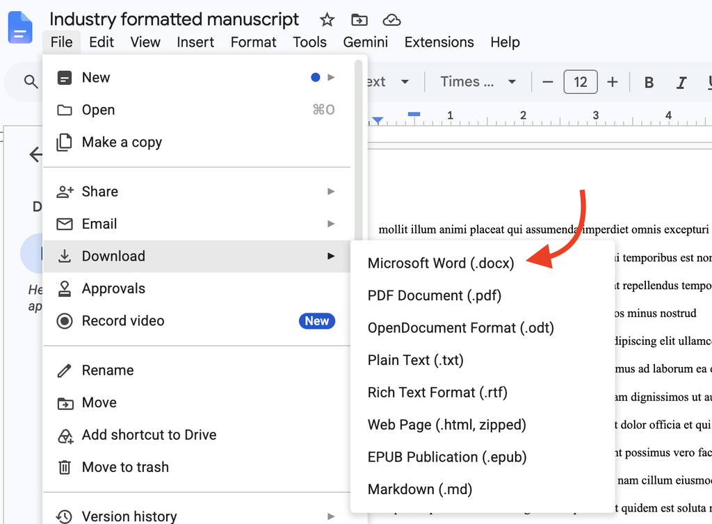
To download it and start using it, go through the File menu within the doc, and download it to a Word file. Or click “Make a copy” if you want to use it in Google Docs:
Now then…
See anything I missed? Have any questions? Take to the comments!
Need help with your book? I’m available for manuscript edits, query critiques, and coaching!
For my best advice, check out my online classes, my guide to writing a novel, and my guide to publishing a book.
And if you like this post: subscribe to my newsletter!
Art: Fabrique de cartes à jouer dans une maison de la place Dauphine, à Paris by Anonymous


This is great. Thanks! Question: Is it necessary for the chapters to have titles? I’ve read books that numbered the chapters and gave the page but no titles.
Chapters definitely don’t need titles, those are optional. But even if you decide to use titles, at the manuscript stage I would still number the chapters so that people who are giving you feedback can easily reference the chapter # rather than having to cite the chapter name.
Thanks!
Here’s one more: Turn off widow/orphan control and maximize words per page.
I have no idea what that means. Sounds intriguing. I’ll have to check it out. Thanks for the tip.
What is the Page Break Function in Word and how does it work?
Rather than tell you the answer that, I think it’s ultimately more helpful to you to give you this: https://nathanbransford.com/blog/2009/07/importance-of-basic-computer-skills/
Hello. If images under each chapter title are planned, should they be included in the formatting? Thanks
1″ margins don’t cut it (way too big) when the book is formatted for 5.5″ x 8.5″, which is a very popular size these days, A 0.5″ is max on this page size, otherwise it looks like a column of words rather than a page, or are you saying you should reformat you manuscript to fit 8.5×11″ pages, which is a lot of work?
Why Double spaced? Makes the document 3 times larger even in electronic format. Does not look like a book manuscript to me when everything is double spaced. And what about Dialog? I have a lot of dialog which is already extra spaced when the character speaking changes.
RSVP
Thank you
Steve
I think the point is that this manuscript format is /not/ book format. Instead, it’s a format that is very clean and easy to read on a screen. If you’re submitting your manuscript to agents, all that matters is that it’s easy to read, navigate, and/or print on standard paper. If you’re preparing to self-publish, then you’re formatting it to look like a book, and different rules apply.
As Nathan states several times, this is a formatting guide to a manuscript– NOT the format for a published book. Don’t submit a novel to an agent/editor as anything other than a ms– they will not appreciate it.
Using format outside the industry standard exerts a pull to the reader’s attention which, it seems to me, is counterproductive to the writer’s intent.
My fervent hope is that the professional reader spending precious time on my work will become absorbed in my story, not distracted by either sloppy mistakes or whimsical ‘creative’ formatting choices.
Standard manuscript formatting also includes text that is aligned left, not fully justified. If it’s fully justified (flush to left and right margins), you get big gaps between words in some lines of text that make it irritating to read. With align left, there is consistently one space between words. So much easier on the eyes.
Yes, good point! I’ll add that.
How long do chapters need to be? Is there a standard?
Nathan, thank you so much for this post. It is extremely helpful!
One question on quotations for dialogue: In final manuscripts, should we use single quotes (‘ ‘) for dialogue, and only use double quotes (” “) for when a speaker is quoting someone else?
Any help would be much appreciated. Thanks again!
I would check some authoritative Style Manuals such as University of Chicago for an answer to your question. There are differences in dialogue punctuation in British vs. American writing.
I would check some authoritative Style Manuals such as University of Chicago for an answer to your question. There are differences in dialogue punctuation in British vs. American writing.
How would format differ if the query was for children’s books with illustrations you want to show?
Hi, on alternate text like a child’s note- would I scan this in in its original form or transcribe using a different font/ italics etc considering it might be difficult to make out or read some words. I’d appreciate some advice on what would be best option? Thank you
Absolutely do not scan/paste as it’s going to make the file really big which increases the chance it’s going to land in a spam filter. Just italicize or something.
Am I missing something? Is this for email manuscript submissions? Also I will look at your computer literacy link, but I am confused about copying and pasting from my document which is in Word.
Am I missing something? Is this for email manuscript submissions? What is the best format to use? Also I will look at your computer literacy link, but I am confused about copying and pasting from my document which is in Word.
Hello Nathan, and thank you for this information. My question: on the cover page should the title be in all caps, bold, or non of the above?
Hi Nathan! I am unable to copy and paste my manuscript into the body of an email so that page numbers are showing. I am using Word, and the page numbers are in the header. Any tips? Thank you so much!
Hi Nathan. Thanks for this post; most useful. Could you expand a bit on the use of Times New Roman (a proportional font) over Courier New (a non-proportional font)? I’m “old school” so still prefer to use Courier New in my manuscripts and calculate my word count the traditional way (i.e. an estimated 250 words per page). How does this work when using proportional fonts like Times? And is it true that some editors now prefer an “actual” word count as opposed to the estimated method?
Secondly, could I please have your advice on correct manuscript placement of “part” headings (e.g. “Book I”, “Book II”). I’ve read that the heading for a new part/division MUST be placed on a separate page, and I’ve also read that the heading MUST be placed on the same page as that part’s first chapter heading. Which is correct or does it not matter? Many thanks, Matt.
Times New Roman and the word count function is industry standard. Courier and 250 words per page was outmoded long ago.
I don’t think there are strict standards around how to place part headings.
If an agent’s submission guidelines states, ‘include first 5 pages of your manuscript’, are those 5 pages determined by word count? For example, average published page is about 250 words, so would we simply include 1,250 words from our manuscript, or do we determine pages based on the 8.5″x11″ manuscript page and however much we wrote in the first 5 pages?
It just means the first five pages in industry standard formatting.
The 250 words per page for calculating word count thing was out of date when I started in publishing in 2002. I don’t know why it keeps persisting.
“he thought,” as a dialogue tag, isn’t the cleanest choice for any italicized text signifying internal monologue or interior thoughts. One clean style: if you’re choosing the italics, you can skip the tag. Nothing wrong with the italics in this usage. Try to avoid them for emphasis, though, if you’re using them to signify thoughts. You say elsewhere, “Some editors don’t know what they’re doing.” I don’t think that includes any who’d see this “he thought” style choice, and warn you away from it. Little details go into a thorough edit. I say, make the copy clean while it’s also clear.
Do authors/editors prefer straight quote marks or smart/curly quote marks in submitted manuscripts?
Hi Nathan, thank you! I have been trawling the internet trying to get this correct, you are the first person to write that it doesn’t have to look like a book when sending to an agent. I’ve been formatting as a book as a I previously self-published. I have a couple of questions. I am non-fiction do I copy the sample chapters (which I think is around 30 pages) as an attachment to the email as I have to write a book proposal too. Also with page numbering, I’m a tad confused, obviously page numbers when it’s formatted as a book is the actual page numbers. How do I set page numbers when its double spaced, nothing like a book? Confused?! First time sending to an agent.
Nathan — thanks so much for this, very helpful.
AND I’ve just ordered your book on writing a novel and will pick up at Vroman’s in Pasadena this weekend. Can’t wait!
Awesome, hope you enjoy it, and I love Vroman’s!
Thanks so much, Nathan! Very helpful. Is a cover page necessary if you’re just submitting 5 pages or whatever sample an agent requests? Also, what happened to the idea of putting a key word along with your last name on the same line as page numbers? Is that bad to do now?
It’s not usually necessary to include a title page for a very brief excerpt, but no one is going to think much of it either way.
I tend to think last name and page number suffices without including the title or a keyword, which starts getting long and distracting. Most agents are reading electronically these days, and if for some reason they’re are paranoid that they’re going to get pages mixed up after printing out a manuscript, they can figure out what to add on their end.
Not sure I agree with you on all points. After all, these are not high school or college research papers. Readable, uncluttered, The brilliance of a well-written book should not be overshadowed by a poor font choice. That said, we editors get manuscripts in all kinds of shape, and we reformat for ease of editing (some fonts are easier to read, such as TNR, as you stated). The final book looks much different when moved through InDesign into real book pages. My colleague, a book designer, and I wrote an even more detailed post on this subject: https://janefriedman.com/your-creative-team-wants-you-to-stop-formatting-and-just-write-the-darn-book/
I read your post with Paul Nylander earlier in the year and I don’t think there’s anything I said that runs contrary to it? There’s more detail in your post, yes, but a lot that’s also more oriented toward nonfiction. My readership skews toward novelists, hence this is a more novel-oriented post that’s focused more on the basics.
Thank you for this comprehensive list, it helps a lot ! Reading it I found my way to your typewriting speed post. I thought I was fairly good but I pulled an appalling score… So now, on top of knowing how to format my manuscript, I will also dedicate some well-spent, quality time with my keyboard lol