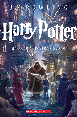
In wizard news from last week, Scholastic released a new Harry Potter cover to commemorate the 15th anniversary of the publication of Harry Potter and the Sorcerer’s/Philosopher’s Stone. The designer is Kazu Kibuishi, and the covers will appear on the trade paperback version of the books. Hollywood.com had an interview with Kibuishi, who is the author of the Amulet YA graphic novel series.
What do you think of the new vision? Do you have a preference between the new and old?


I think the new cover gives a better glimpse of the story. You can 'feel' more of the story's vibe with the new cover.
I like it, I feel like it gives a better sense of the world. Oh wait, Melanie just said that. Oh well, I say it too.
I love the depth in the image. It draws you in the way the story should.
Also – it's been 15 years already?!? Gah!
*LOVE* this^ one.
Overall I like it, I'm a fan of the 'cool blue' look of it. However, I do think the smaller lettering of Rowling's name and the not-exactly-a-subtitle gets lost a bit in the background.
I'm in agreement with the others. I like it!
I like it, too! He did a wonderful job with this first book, and I'm looking forward to seeing the other covers. Nothing will ever compare to Mary GrandPre's magical illustrations, though. I still prefer the originals! Can't believe it's been 15 years already.
Ooh, gorgeous! But what I loved most about the original covers were their progression from light to dark as the series got darker and darker. The kind of blue feeling of this cover doesn't convey the initial joy of the magical world enough, I don't think.
I think it is beautiful!
Gorgeous! Although I liked the original artist, this is terrific.
If the Publisher is trying to sell books, this is very smart. I might buy one for a collectable.
Is it really 15 years???? Wow.
I love the new cover, but not enough to buy them again.
I'm normally resistant against change, but I have to admit I love the new cover for Sorcerer's Stone. It's such a beautiful portrayal of Diagon Alley! I also think you get a sense of how big this world is, how much wonder there is, which wasn't quite established with the original cover (though I did really like the Mary GrandPre covers, especially the later ones).
I like the old cover. Although this new one gives you a sense of the Harry Potter world,I think the lack of that with the old covers was part of the fun. The further you read into the story the more your mind could imagine and create the world in your head.
If this had been the original cover I would have read Harry Potter a lot sooner. Not because of a lack of skill on the first cover artist's part, but because this cover evokes exactly what I want from fantasy.
New cover is awesome. Makes me want to read it for, oh, the fifth time. Not really, I have lots more important things to do. But I do think it's way mo' bettah than the original. 🙂
I like it! I have never read any of the books and am an aspiring writer, yes I hold my head low in shame, its become one of my bucket list things to accomplish.
Oh Keisha, you definitely must add them to your TBR list! JeffO, I agree that the subtitle seems to fade into the background. But, overall I love the image and its dimensions. There is great depth which, like Lauren said, draws you in.
I hope it does attract that tween audience that grew up with the movies but haven't yet read the books.
Can't say I care for this one. Though to be fair, I didn't care for the original cover of this book either. My preteen and my teenager say that the new cover makes it look like Hagrid is the main character, accompanied by an owl-wielding sidekick.
I just can't get behind this one. It's nice and all, but Harry looks remarkably like Where's Waldo… I'll stick to the original.
And to mirror what others have said "15 years already?" Yikes.
It's a beautiful cover. It looks as if it's designed specifically to appeal to a younger reader. Are they trying to pull in the next generation of readers? Since their original fans are aging, that's probably really smart marketing. Sales will tell.
I guess I'm too nostalgic. I like the old better.
I like it. I think I prefer it to the original cover.
I'm too depressed over it being 15 years already to think about it much.
Ok, I like it.
I have been a fan of Kazu Kibuishi since discovering the 'Flight' graphic novels in the library. His artwork is beautiful and magical. I know he will do justice to the series. This makes me want to buy the books again, just to have these fantastic covers!
Personally, I prefer the french covers which respect more the spirit of the book.
Take a look :
Cover 4
Cover 7